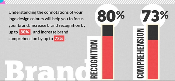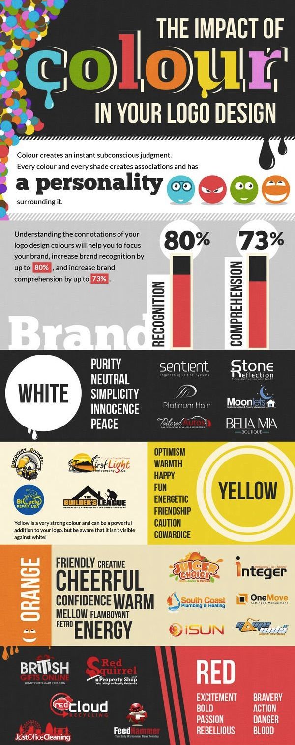
When designing a logo the colors you use have a huge psychological impact on the recognition and perception of your brand. In fact, the colors your choose can increase brand recognition by as much as 8% and brand comprehension by up to 73% according to the infographic below. Take a few minutes to learn about the psychology of different colors but makes sure to remember two important rules:
1. You don’t have to sacrifice readability. The right color scheme can actually improve readability of your logo.
2. Don’t be afraid to stand out from the crowd. If all your competitors use the same colors for the their logo do something different and make your company stand out.
Infographic courtesy of British Logo Design.


