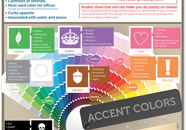
Applying color psychology to your marketing and branding can help. Depending on the color you can influence a persons mood, emotional state and perception of your brand. Choose the right color for your brand’s product and customers will be primed to buy. To better understand how to apply color psychology to your website and marketing material take a look at the psychology of primary colors and check out the infographic below.
Psychology of Primary Colors
Some colors just work better than others in specific situations and settings. Let’s take a quick look at the primary colors before reviewing the infographic.
Yellow
Yellow is a great color for getting peoples attention. It normally evokes a cheerful and warm feeling however, it does produce eye fatigue quickly.
Blue
Blue is an effective color for work and business. It is the most popular color among men and known to evoke feelings of calmness.
Red
Red is a color that symbolize emotion. The color tends to evoke feelings of passion and intensity.
Colors for Marketing
When choosing a color scheme it is important to consider color psychology as well as how the colors work together. Finding the perfect colors can be time consuming and tedious. Luckily, a number of free websites can help with pre-built color schemes and tools to help make the entire process easier.
One of our favorite color scheme tools is Kuler from Adobe. With Kuler you can browse a large collection of pre-built color schemes as well as use their tools to create your own. It is a great way to find a couple good color schemes that can be quickly tweaked to meet your needs.
Color Psychology and Marketing Infographic
Infographic courtesy of CertaPro Painters and Painters of Louisville.com.

